
Eke Panuku
Panui
Our monthly panui sharing kōrero from our tūpuna, news from the trust, and updates for the whānau.
Read more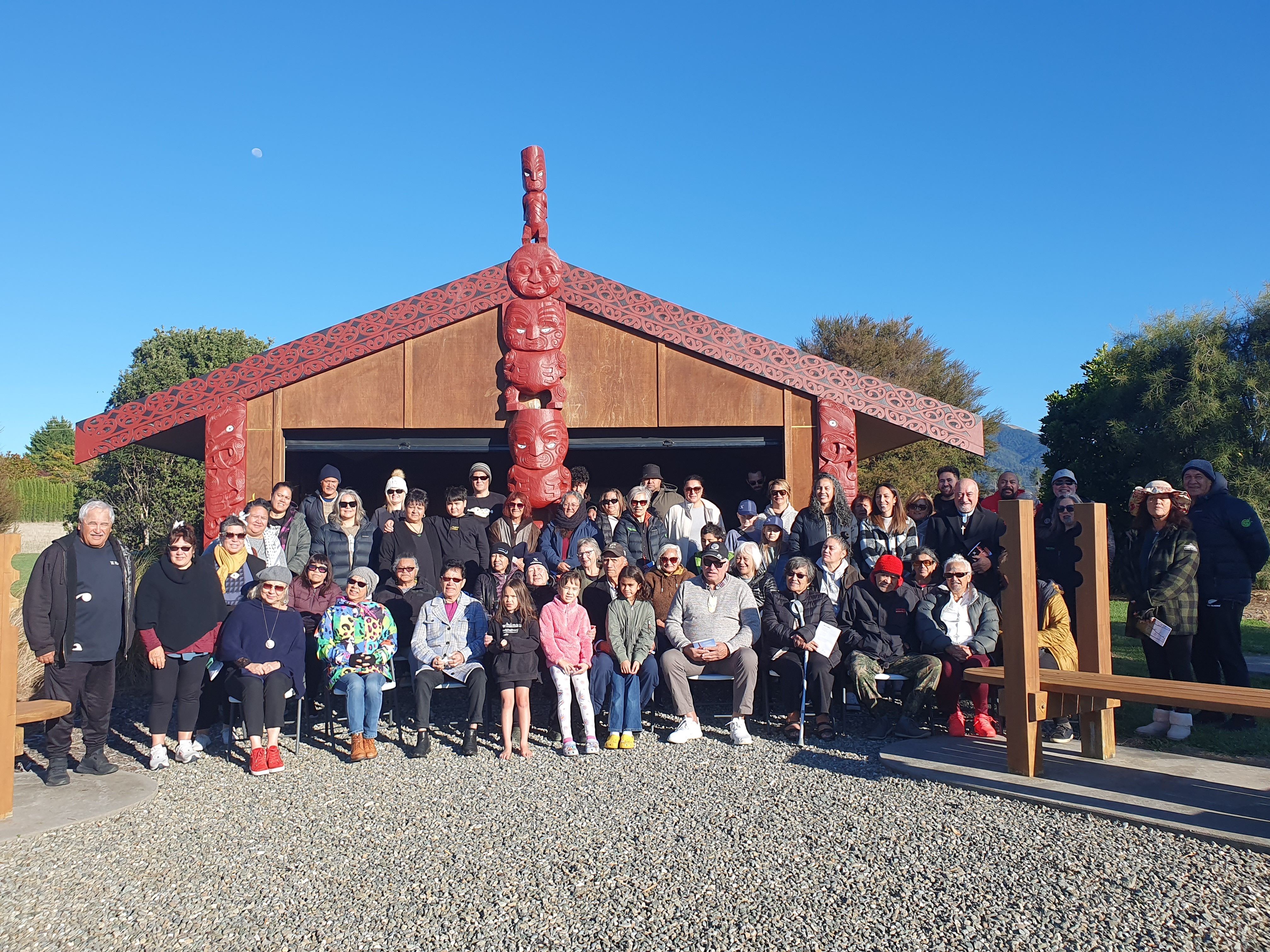
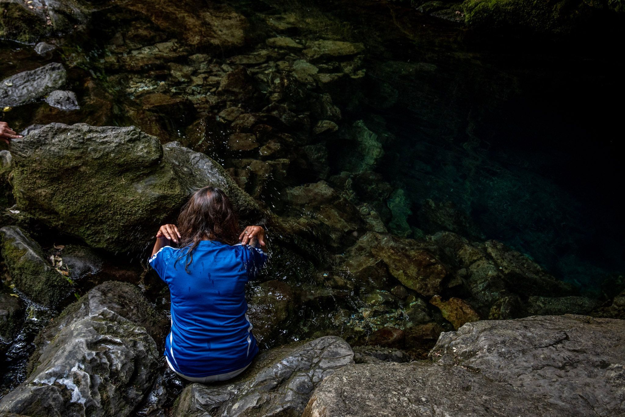
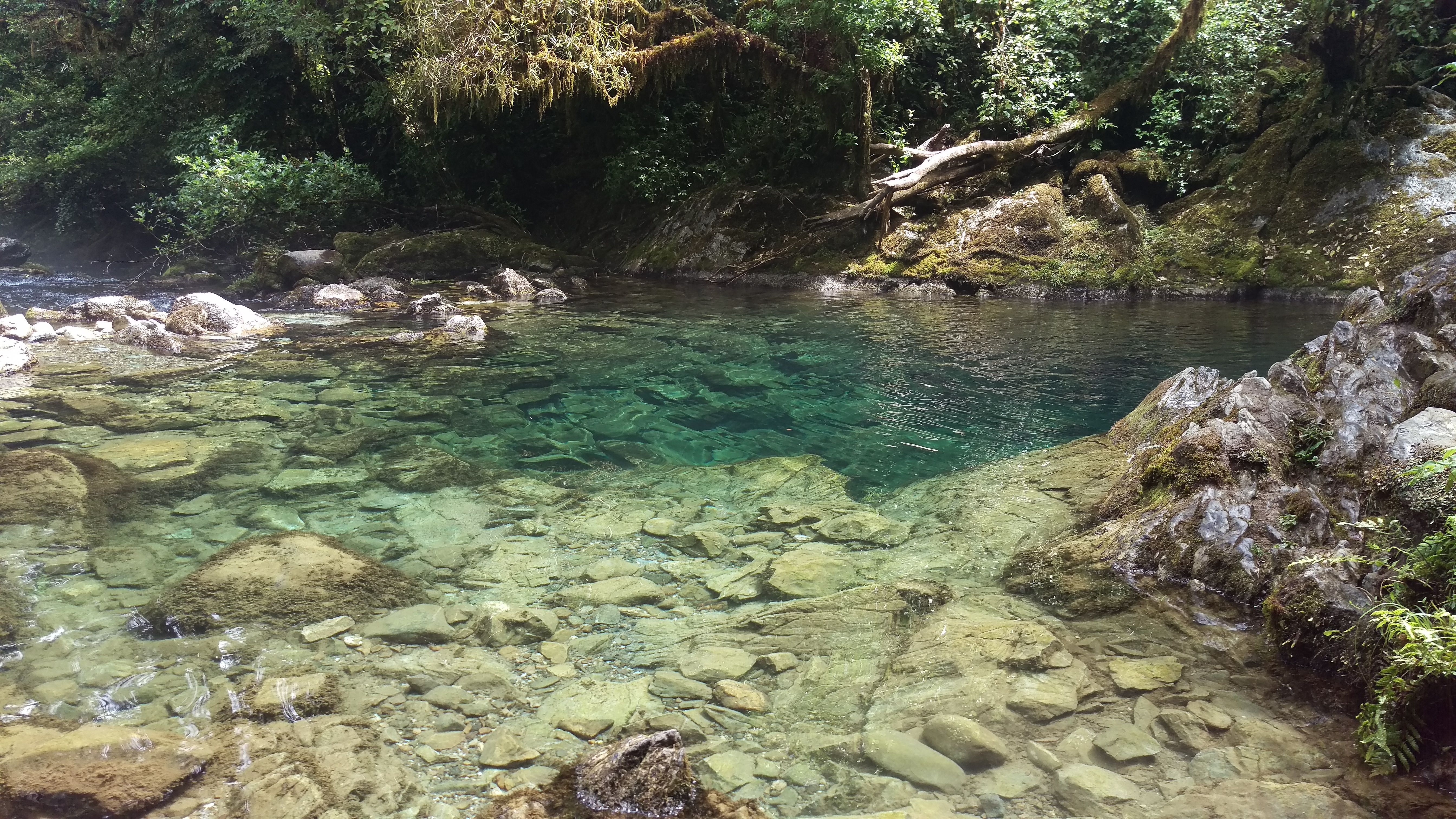
The Ngāti Rārua Ātiawa Iwi Trust represents a unique group of descendants from two iwi. They whakapapa back to one or more of our 94 Ngāti Rārua tūpuna and 15 Te Ātiawa tūpuna. These ancestors are the original landowners of our Motueka homelands. As a Trust, we manage and nurture these land holdings on behalf of and for the benefit of all the descendants of the original 109 owners.
Our monthly panui sharing kōrero from our tūpuna, news from the trust, and updates for the whānau.
Read moreInvesting in the next generation through scholarships, grants, and Manawaroa rangatahi development.
Read moreRegister your whānau so we can keep you connected with grants, scholarships, and Te Mātū invitations.
Read moreEach year we award scholarships and grants that help our whānau pursue education, culture, and mahi.


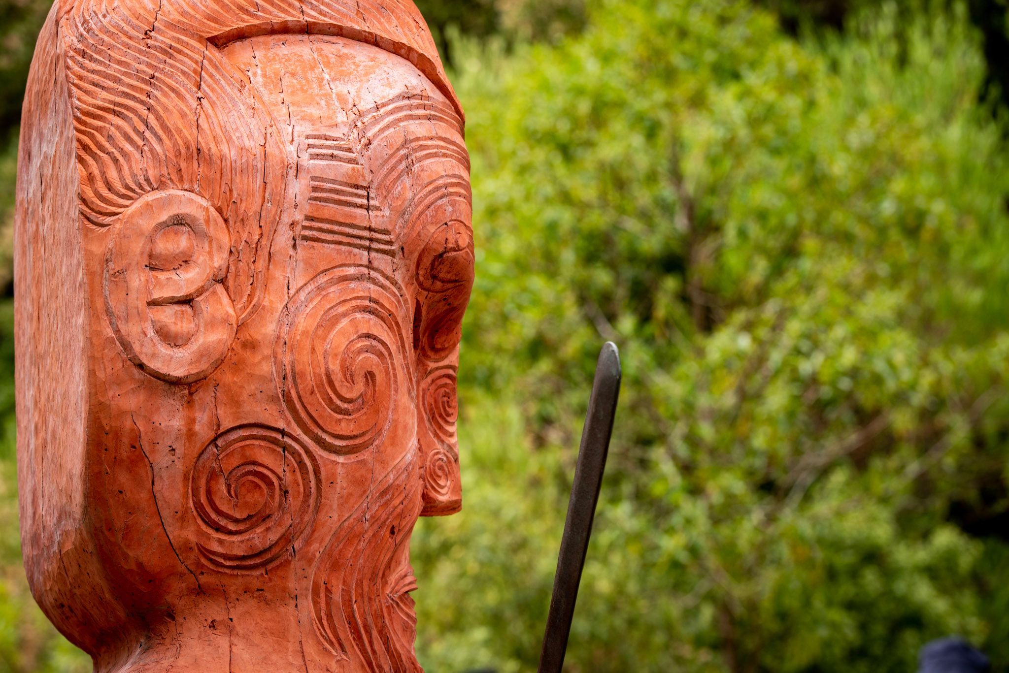
Our histories, our places, and the people who have shaped who we are.
This is rich text